[click on image for details]
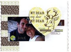
i started this layout at my friend J's crop last weekend. i realized i've done a lot of anniversary layouts ... more than the kids' birthday layouts! the "my dear" letterpress card is from hello lucky and it looks really yellow in the scan, but it's actually green.
i don't know if i should add more journaling ... i was trying to layer stickers but i'm not sure i accomplished the right amount of layering; it looks a little skimpy to me. what do you think?
1 comment:
Cute layout! The deer sticker is adorable and perfect sentiment for the layout. I vote some journaling in the lower right section, maybe done in strips I think. It would give the layout a bit more weight to the lower portion. I think the sticker layering won't look so skimpy then too...maybe.
Post a Comment